今天我用em和rem做了一些小实验,总结了几个规律,接下来我就和你分享下。
1.rem是相对于html标签的单位
这一点毋庸置疑!
HTML:
<!DOCTYPE html>
<html>
<head>
  <meta charset="utf-8">
  <meta name="viewport" content="width=device-width">
  <title>JS Bin</title>
</head>
<body>
  <div id="parent">
    <div id="child">child</div>
  </div>
</body>
</html>
CSS:
html {
  font-size: 10px;
}

body {
  font-size: 50px;
}

#parent {
  height:150px;
  background:#9cd4d8;
  font-size: 20px;
}

#child {
  background: #cbb9ff;
  font-size: 2rem;
}
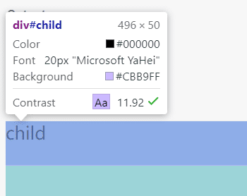
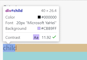
效果如下图,child的font-size是按照html的font-size来设置的,不是body,也不是父元素。
2.font-size的情况下,em是根据最近的祖先元素来设置的
把样式改成下面这样:
html {
  font-size: 10px;
}

body {
  font-size: 50px;
}

#parent {
  height:150px;
  background:#9cd4d8;
  font-size: 20px;
}

#child {
  background: #cbb9ff;
  font-size: 2em; /* <--- 这里用em代替了rem */
}
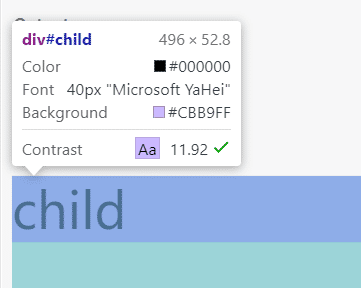
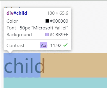
这样之后child的font-size就变成了parent的两倍,也就是40px。
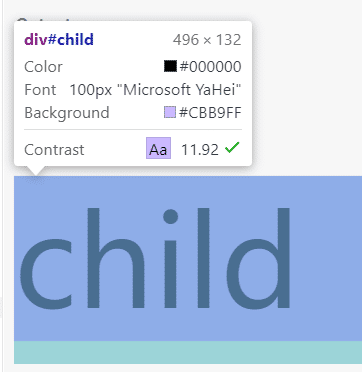
如果把parent的font-size注释掉,那么child的font-size就会根据上一个有定义font-size的祖先元素(在这个例子里是body)来设置。
3.当width用em作单位时是根据当前元素或者祖先元素的font-size值来计算的
这里分两种情况:
注意:以下两种情况都是在width以em作为单位的前提下
情况一:当前元素设置了font-size
如果当前元素设置了font-size,那么用em作为单位的width就会根据这个font-size的最终值来计算。
html {
  font-size: 10px;
}

body {
  font-size: 50px;
  padding-top: 100px;
}

#parent {
  height:150px;
  background:#9cd4d8;
  font-size: 20px;
}

#child {
  background: #cbb9ff;
  font-size: 30px;
  width: 2em;
}
这里child的font-size为30px,width设置为2em,那么最终child的长度为 2 × 30px = 60px:
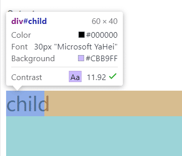
font-size使用其他单位时结论也是一样的:
#child {
  background: #cbb9ff;
  font-size: 2rem;
  width: 2em;
}
这时2rem就是20px,最终长度就是 2 × 20px = 40px:
情况二:当前元素未设置font-size
在这种情况下,width会根据最近的设置了font-size的祖先元素来计算。
html {
  font-size: 10px;
}

body {
  font-size: 50px;
  padding-top: 100px;
}

#parent {
  height:150px;
  background:#9cd4d8;
  font-size: 20px;
}

#child {
  background: #cbb9ff;
  /* font-size: 2rem; */
  width: 2em;
}
这里把child的font-size注释掉,child的width就会根据最近的设置了font-size的祖先元素(在这里是parent)来计算:
如果把parent的font-size也注释掉
html {
  font-size: 10px;
}

body {
  font-size: 50px;
  padding-top: 100px;
}

#parent {
  height:150px;
  background:#9cd4d8;
  /* font-size: 20px; */
}

#child {
  background: #cbb9ff;
  /* font-size: 2rem; */
  width: 2em;
}
child的width就会根据上一级设置了font-size的祖先元素(在这里是body)来计算:
仔细观察本节的几张图片你会发现,不管哪种情况,当以em作为width的单位时,width都是根据当前元素的font-size来计算的,因为font-size会从祖先元素继承而来。在这个例子里,我们把child的width设置为2em,所以child的长度永远等于child的font-size × 2。