昨晚看到室友在面试一个候选人,无意中听到一道题:CSS 中百分比宽度根据什么来计算?
当时仔细听了他的解释,不知道说的到底对不对,于是自己亲自试了一遍,发现他的解释确实不太对。
下面我会通过例子,说明 width 在百分比的情况下是根据什么来计算的。
首先来看最简单的情况:
<div class="parent">
  <div class="child"></div>
</div>
div {
  border: 2px solid;
}

.parent {
  width: 200px;
  height: 50px;
  border-color: green;
}

.child {
  height: 30px;
  width: 50%;
  border-color: blue;
}
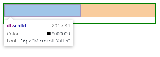
这个很简单,结果也是一目了然的,child 的宽度就是 parent 宽度的 50%,即 200 _ 50% + 2 _ 2 = 204px。这里因为描边的宽度是 2px,所以要把这个算上。
接下来让我们看一个稍微复杂点的例子,父子元素的宽度都是百分比,那么结果会是什么样呢?
<div class="super">
  <div class="parent">
    <div class="child"></div>
  </div>
</div>
div {
  border: 2px solid;
}

.super {
  height: 70px;
  width: 600px;
  border-color: red;
}

.parent {
  width: 50%;
  height: 50px;
  border-color: green;
}

.child {
  height: 30px;
  width: 50%;
  border-color: blue;
}
这一次,我们把parent和child的宽度都设为50%,把外层元素super的宽度设为600px,让我们看看结果会是怎样:
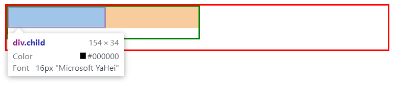
我们可以看到,parent的宽度根据super的50%来计算,就像第一个例子一样;而child的宽度,是根据parent宽度的计算结果的50%来计算,这样也很符合直觉。
让我们继续深入,探究百分比宽度在不同定位方式下是如何表现的。
我们知道,position的默认值是static,所以相当于static定位我们已经实验过了,那么接下来我们看relative定位的情况:
.child {
  height: 30px;
  width: 50%;
  border-color: blue;
  position: relative;
}
下面是结果图:
我们看到,relative定位和static定位,百分比宽度的表现并没有什么两样。
那么接下来,我们再来看看absolute定位:
.child {
  height: 30px;
  width: 50%;
  border-color: blue;
  position: absolute;
}
这一次,情况就不同了:
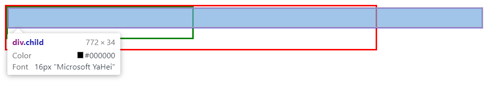
我们看到,child的宽度变成了772px,显然不再是parent宽度的50%了。
那这个772px,到底是谁的宽度的50%呢?body?还是html?
让我们来揭开它的面纱!
要想知道是body还是html,只需给body和html都设置一个固定宽度,这样就可以看出来了:
<!DOCTYPE html>
<html>
<head>
	<title>percentage width test</title>
	<style type="text/css">
		html {
			border: 2px solid yellow;
			width: 1000px;
		}

		body {
			border: 2px solid orange;
			width: 800px;
		}

		div {
		  border: 2px solid;
		}

		.super {
		  height: 70px;
		  width: 600px;
		  border-color: red;
		}

		.parent {
		  width: 50%;
		  height: 50px;
		  border-color: green;
		}

		.child {
		  height: 30px;
		  width: 50%;
		  border-color: blue;
		  position: absolute;
		}
	</style>
</head>
<body>
	<div class="super">
	  <div class="parent">
	    <div class="child"></div>
	  </div>
	</div>
</body>
</html>
结果如图:
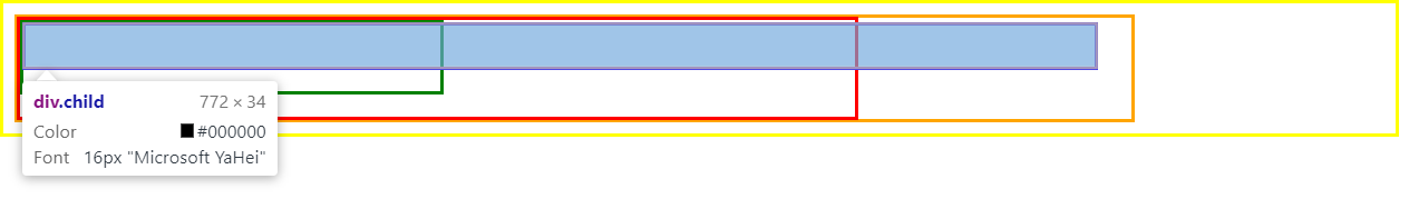
最外面的黄框是html标签,往里面一层的橙框是body标签。可见,百分比宽度的绝对定位元素,它的宽度计算既不是根据body,也不是根据html,而是——————浏览器窗口宽度!
下面我们来验证一下。
首先,我们需要获取浏览器窗口宽度:
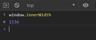
是1536px。
1536 / 2 + 2 * 2 = 722
而child的宽度,刚好是722px:
说完了absolute,还有fixed定位。只是经过实验,fixed定位与absolute定位,百分比宽度的表现是一模一样的,不再赘述。
至此,本文主要内容已经结束。但是本着严谨的原则,我不知道position是不是唯一的影响因素,所以你需要注意这一点。如果你知道还有别的影响因素,烦请通过底部的GitHub链接告知我,我也会及时更新到这篇文章中,不胜感激!